¶ Customer status chart
¶ Overview
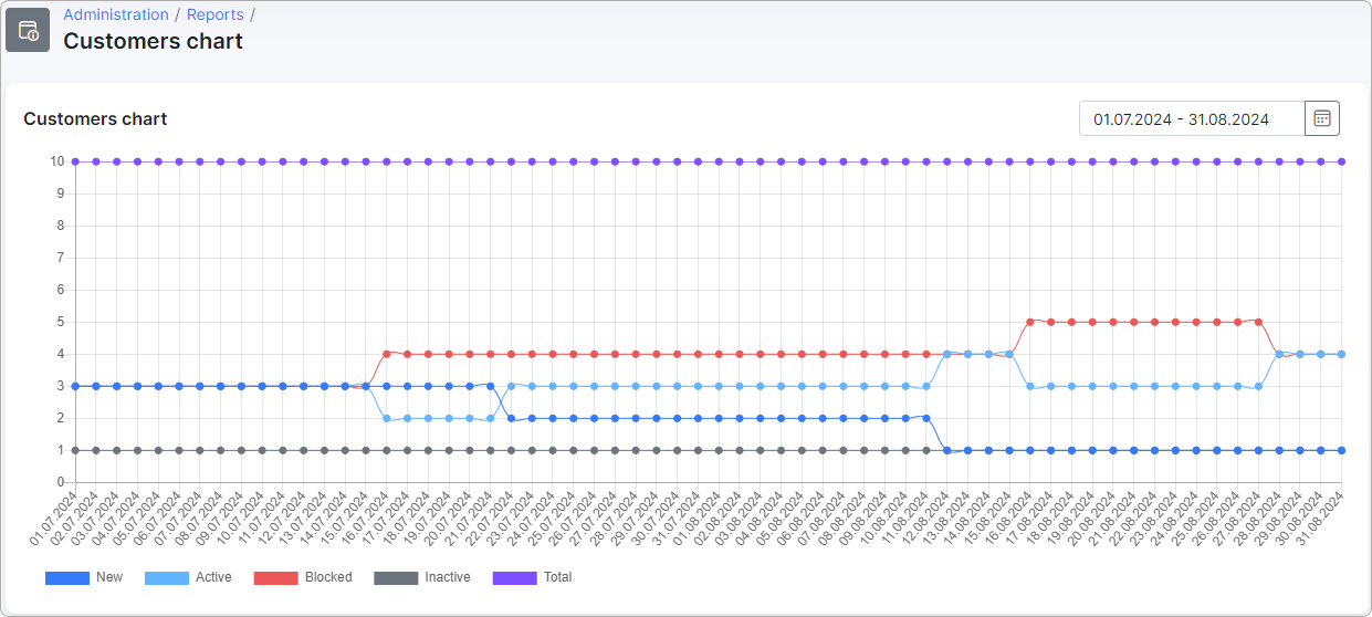
The Customer status chart shows how many customers were in each status — New, Active, Blocked, Inactive — on every day in a chosen date range, plus a Total line that combines all four. Use it to track how the customer base is shifting over time: how quickly new sign-ups become active, how many accounts are currently blocked, and whether the overall base is growing or shrinking.
This chart is shown by default. It reads the same daily customer statistics that power the Total customers report: the chart plots the per-status counts for each day, while the report summarizes the month-by-month movement behind those counts. The chart's daily Total line matches the report's Month Start and Month End figures, since both count every customer in all statuses except leads.
To open the report, go to Administration → Other reports → Customer status chart:

The numbers on the chart are not calculated in real time. Once a day, Splynx records a snapshot of the current status counts and stores them. The chart then reads those daily snapshots back. Because the snapshot is written shortly after midnight and represents the state of customers from the day before, the most recent point on the chart is always one day behind today — today's numbers do not appear until the next daily run.
¶ Filters
A single control sits in the top-right corner of the report and applies to both the chart and the data behind it.
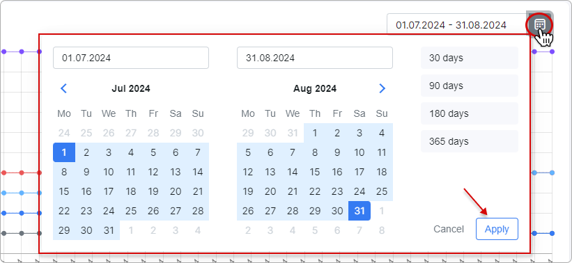
- Date range — pick a custom start and end date, or use one of the presets: 30 days, 90 days, 180 days, 365 days. The default range is the last 30 days. Click the calendar icon to open the picker, choose the range, and click
Applyto redraw the chart.
¶ Chart
The chart is a line chart with one point per day in the selected range. Each line tracks one status; a fifth line, Total, shows the combined customer base for that day.
- X axis — calendar dates in the selected range, one tick per day.
- Y axis — number of customers.
- Lines — New (dark blue), Active (light blue), Blocked (red), Inactive (gray), and Total (purple).
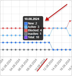
Hover over any point on the chart to see the exact count for that status on that date.
If a day in the selected range has no snapshot — for example because the system was installed after that date, or the daily background job did not run — the chart simply has no point for that day. There is no historical backfill: the chart begins from the first day a snapshot was written.
¶ How values are calculated
This section describes which customers the snapshot covers and how each line on the chart is built.
¶ Which customers are counted
Each daily snapshot looks at every record in the customer base and applies two filters before counting:
- Leads are excluded. Only customers count — accounts whose category is Lead are skipped.
- Deleted customers are excluded. Accounts that have been deleted from Splynx are not counted on any line, not even on Total.
Every other customer (residential, business, or any other category configured on the system) is included.
¶ What each line means
Every customer falls into exactly one status on a given date, and is counted on exactly one line for that date.
| Line | What it represents |
|---|---|
| New | Customers in the New status — created but not yet connected to services. |
| Active | Customers in the Active status — currently using their services. |
| Blocked | Customers in the Blocked status, whether they were blocked automatically (for example by non-payment) or manually by an administrator. |
| Inactive | Customers marked as Inactive — the "doesn't use services" status, applied either automatically or manually. |
| Total | The full count of non-deleted, non-lead customers on that date. This equals New + Active + Blocked + Inactive. |
Total is not the count of currently active customers. It is the entire customer base in the system on that date, summed across all four statuses.
¶ Snapshot timing and freshness
A daily background job runs once at midnight (server time) and writes one snapshot row for that day. The job is the only writer of these statistics — the report itself does not recalculate from live data.
- The snapshot is labelled with the previous day's date. The run shortly after midnight on, for example, May 12 produces a snapshot for May 11 and represents the state of customers at the moment the job ran.
- If the snapshot for a given date already exists, the job does not overwrite it. Re-running the daily job by hand on the same day will not change existing rows or create duplicates.
- Repeated reloads on the same day are served from cache. The cache is refreshed automatically when the next daily snapshot is written.
For a refresher on Splynx customer statuses, see Customer status.
¶ Examples
Spotting a wave of blocks. Open the report with the 90 days preset at the end of a billing cycle. A sudden climb on the red Blocked line — without a matching drop on Active the same day — usually points to the auto-blocking step that runs when invoices go unpaid. Compare the size of the climb to typical months to gauge whether collections are on track.
Checking sign-up onboarding. With the 30 days preset, watch how the New line and the Active line move together. New customers should not stay in New for long: a healthy onboarding flow shows the New line staying low while Active grows. A New line that climbs steadily and never falls suggests sign-ups are not being connected to services on time.
¶ Important notes
- The most recent point is yesterday, not today. The daily snapshot for today is taken at the next midnight run, so today's counts never appear in real time.
- Leads are not on the chart. If you need a count that includes leads, use a different report — Total here is customers only.
- Deleted customers are gone from every line. Restoring a deleted customer brings them back into the next daily snapshot, but earlier snapshots stay as they were.
- Total = New + Active + Blocked + Inactive. If a snapshot ever shows a mismatch, it was taken at a moment when status changes were in flight. Wait for the next day's snapshot before investigating further.
- History begins at the first snapshot. Days before the daily job first ran on the system do not exist in the data and will not appear on the chart, even if you pick an earlier start date.