¶ Financial report per plan
- Overview
- Filters
- Period for comparison
- Comparison chart
- Table
- How values are calculated
- Examples
- Important notes
- Export
- Related pages
¶ Overview
The Financial report per plan shows how much money has been billed across each tariff plan during a chosen period and compares the result against another period of the same length. It helps you see which plans bring in the most revenue, which are growing, and which are shrinking.
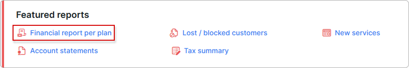
Navigate to Administration → Featured reports → Financial report per plan.
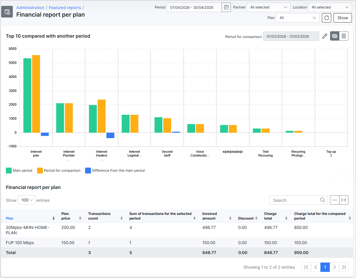
The page contains three areas: a filter bar at the top, a chart that compares the top plans of the main period with the comparison period, and a table with a full per-plan breakdown for both periods.
¶ Filters
The filter bar at the top of the report defines what data is included in both the chart and the table. After changing any filter, click Show to apply, or click the refresh icon to re-run the same query.

- Period — the main reporting period. Defaults to the current month.
- Partner — limits results to customers who belong to the selected partners. Multi-select; defaults to all partners.
- Location — limits results to customers from the selected locations. Multi-select; defaults to all locations.
- Plan — service type to include. Options:
- All — combines all four service types listed below.
- Internet — visible only when the Internet module is enabled.
- Voice — visible only when the Voice module is enabled.
- Recurring — non-internet, non-voice services that repeat on a billing cycle.
- One-Time — services charged once.
¶ Period for comparison
The Period for comparison is a second period of the same length as the main one. It is shown above the chart and is used to calculate the Period for comparison, Difference from the main period, Sum of transactions for the selected period, and Charge total for the compared period values.
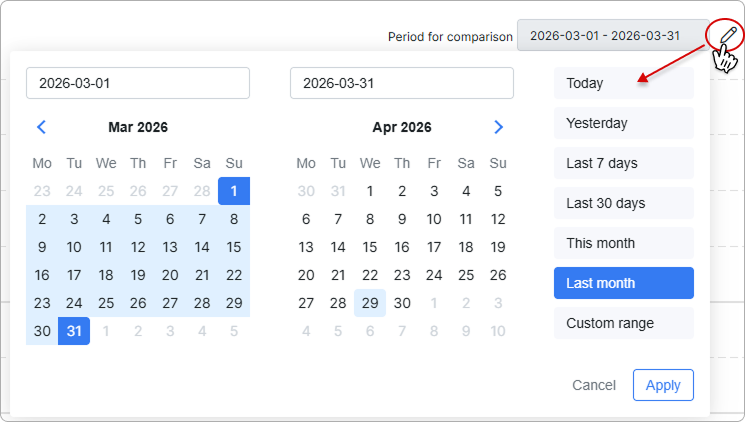
When you change the main period, Splynx suggests a comparison period automatically:
- If the main period is exactly one or more whole calendar months (for example, 2026-04-01 → 2026-04-30), the suggested comparison period is the same number of months immediately before it (here: 2026-03-01 → 2026-03-31).
- Otherwise, the comparison period is shifted back by N + 1 days so the two windows have the same length and do not overlap.
To override the suggestion, click the pencil icon next to the comparison date range and pick a custom range.
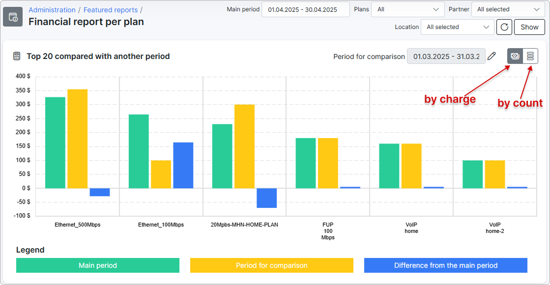
¶ Comparison chart
The chart is titled Top 10 compared with another period and shows the top plans for the main period side by side with their values for the comparison period. The chart loads up to 20 plans sorted by the selected metric — extra plans become visible when the chart is resized.
Use the icons in the top-right corner of the chart to switch between two views:
By charge— bar heights represent money (charge total per plan).By count— bar heights represent the number of transactions per plan.
Each plan has three bars in the legend; click a legend entry to toggle that dataset on or off.
| Dataset | Colour | Meaning |
|---|---|---|
| Main period | Green | The metric (charge total or transaction count) for the period selected in the filters. |
| Period for comparison | Orange | The same metric, calculated for the comparison period. |
| Difference from the main period | Blue | Main period minus comparison period. Negative values mean the metric decreased. |
When you hover over a bar, the tooltip shows the full plan title. In By charge mode it also shows the value with the configured currency prefix or suffix.
If no transactions match the filters, the chart shows the message No data to display.
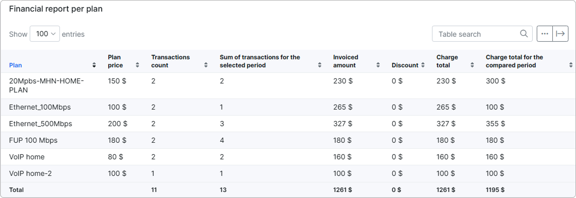
¶ Table
The table below the chart, Financial report per plan, lists one row per tariff plan that had at least one transaction in the main period. The footer row labelled Total shows column-wise sums across all displayed plans.
| Column | Description |
|---|---|
| Plan | Tariff plan title. |
| Plan price | The plan's configured price. This is a reference value (the plan price as set in the tariff configuration), not a sum. Always shown in the system currency. |
| Transactions count | Number of transactions for this plan in the main period. |
| Sum of transactions for the selected period | Number of transactions for this plan in the comparison period. The column is used to compare activity between the two periods. |
| Invoiced amount | Money charged for this plan in the main period — the total of all debit transactions (the charges that increase what the customer owes). |
| Discount | Total of credit transactions for the plan in the main period — credits or discounts that reduced the charge. |
| Charge total | Net amount charged in the main period: Invoiced amount − Discount. |
| Charge total for the compared period | The same net amount, calculated for the comparison period. Use this column to see how revenue per plan changed between the two periods. |
The standard Show/hide columns control above the table lets you hide any column except Plan and Plan price, which are always visible.
¶ How values are calculated
All numbers in the chart and the table come from charges that were actually added to invoices for tariff plans. The report walks through the data in this order:
- It collects every charge added to an invoice for a tariff plan, where the charge date falls inside the selected period.
- Cancelled charges are removed.
- Each charge is matched to its tariff plan and to the underlying service. Services that have been deleted are skipped.
- If you set a Partner or Location filter, the report keeps only charges that belong to customers in those partners or locations. Customers marked as deleted are excluded from these filtered results.
- The remaining charges are grouped by tariff plan title — every plan with at least one charge becomes a table row.
- When Plan is set to All, the result combines charges from Internet, Voice, Recurring, and One-Time plans into one list.
The same six steps are applied a second time, with the date range replaced by the comparison period, to fill in the Period for comparison, Difference from the main period, Sum of transactions for the selected period, and Charge total for the compared period values.
¶ Transactions count and Sum of transactions for the selected period
For the main period, the report counts how many qualifying charges each plan has and shows the result in Transactions count. The same count is calculated against the comparison period and shown in Sum of transactions for the selected period.
¶ Invoiced amount and Discount
For each plan, the report adds up the money side of its charges in the main period:
- Invoiced amount sums every debit charge — the lines that add money to a customer's invoice for that plan.
- Discount sums every credit charge — the lines that reduce the amount the customer has to pay (for example, manual discounts or refunds applied to the same plan).
¶ Charge total and Charge total for the compared period
Charge total is Invoiced amount − Discount. It represents the net revenue the plan generated during the main period.
Charge total for the compared period runs the same calculation against the comparison period, so the two columns can be read side by side.
¶ Chart values
In By charge mode the chart plots Charge total for the main period (green), Charge total for the compared period (orange), and the difference between them (blue) for each of the top plans.
In By count mode the same three bars use Transactions count instead of charge totals.
¶ Examples
End-of-month revenue review. Keep Period at the current month, leave the other filters at their defaults, and click Show. The chart highlights which plans contributed most revenue this month, and the Charge total for the compared period column tells you whether each plan earned more or less than last month.
Growth check for a single location. Set Period to the current quarter, change Location to a single branch, and use the pencil icon on Period for comparison to point at the same quarter last year. The table now shows a year-on-year comparison for that location.
¶ Important notes
- Manual payments that are not linked to a tariff plan transaction are not included.
- Transactions whose service is not linked to a plan (orphan one-off charges) are not included.
- Soft-deleted transactions and services are excluded.
- When the Partner or Location filter is active, customers marked as deleted are excluded from the result.
- Charge total is not always equal to Plan price × Transactions count. Prorated billing, mid-period changes, and manual adjustments make individual transactions differ from the plan's reference price.
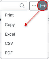
¶ Export
Use the export button  above the table to print, copy, or export the data to Excel, CSV, or PDF.