¶ MRR reports
- Overview
- Common filters
- How MRR is calculated
- Net change tab
- Detailed tab
- By tariff plan tab
- By partner / location tab
- Cohort analysis tab
- At risk tab
- Top customers tab
- Performance and timing
- Data export
- Related pages
¶ Overview
The MRR reports page brings together seven sub-reports built from the same daily snapshot of monthly recurring revenue (MRR), so you can see how revenue is moving, where it comes from, and which customers drive it.
Navigate to Administration → Other reports → MRR reports:

Monthly Recurring Revenue (MRR) is the predictable, recurring portion of revenue your customers contribute every month — the value of their active services and any active discounts, before invoices or one-off charges.
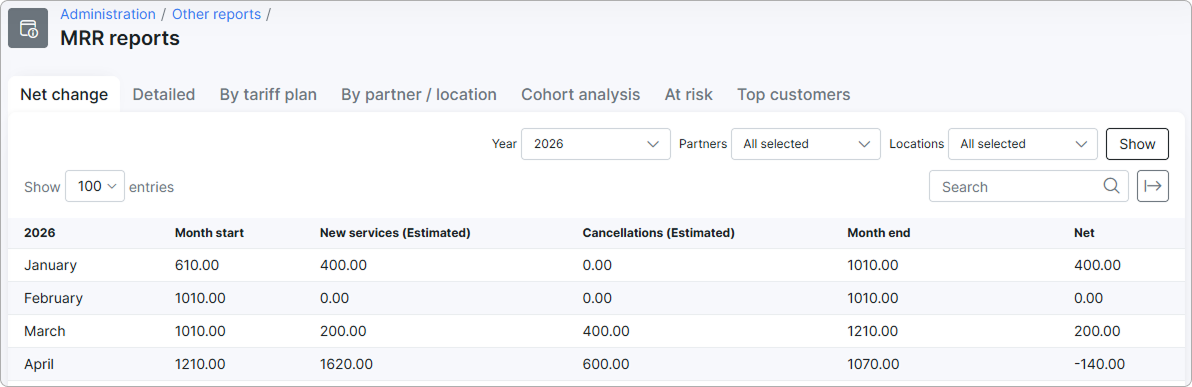
The MRR reports page collects that figure into a single tabbed view with seven angles on the same data:
- Net change — month-by-month MRR for one year, including new business and cancellations.
- Detailed — every customer whose MRR moved during a chosen period, with the reason.
- By tariff plan — which tariff plans contribute the most MRR on a given date.
- By partner / location — MRR distribution across partners or locations, with optional date comparison.
- Cohort analysis — how MRR retention evolves for customers grouped by their signup month.
- At risk — customers whose MRR has dropped significantly from their own peak.
- Top customers — the highest-paying customers on a given date.
Access is available to Super Administrator, Administrator, Manager, and Financial Manager roles. Partner administrators see only data for their own partner.
¶ Common filters
Three filters appear on most tabs and behave the same way everywhere:
- Year, Period, Date, etc. — depending on the tab, this is the time window or the snapshot point. Defaults are the current year, current month, or today.
- Partners — multi-select; restricts the report to customers belonging to the chosen partners. Defaults to All selected. Partner administrators are locked to their own partner and cannot change this filter.
- Locations — multi-select; restricts the report to customers in the chosen locations. Defaults to All selected.

After adjusting filters, click Show to load the report. Each tab runs as a background task, so the chart and table appear once the calculation completes.
¶ How MRR is calculated
Every tab on this page reads from the same daily MRR snapshot, so understanding how that snapshot is built makes the rest of the page easier to interpret.
¶ Daily snapshot
Once a day, Splynx walks through every customer and writes a single value: that customer's recurring revenue normalized to one day. The daily value is calculated as the sum of every active service the customer has — Internet, Voice, Recurring, and Bundle — using this rule for each service:
(quantity × unit price) ÷ billing-period length − discount
The billing-period length comes from the tariff plan when the customer is on a prepaid-monthly tariff plan with a tariff-defined period; otherwise it is the number of days in the calendar month. This converts a monthly recurring price into a per-day value so partial months can be measured.
A service contributes to MRR only when:
- It is active and not deleted.
- It has a unit price.
- The snapshot date falls between the service start and end dates.
A discount is subtracted only when it is enabled, has a value greater than zero, and the snapshot date is inside its active period. Fixed-amount discounts are divided by the same billing-period length; percentage discounts are applied to quantity × unit price and then divided by the period length.
Customers with sub-accounts in Aggregated sub-billing mode are rolled up into the parent account so their MRR is counted once.
¶ Monthly and period MRR
Whenever a tab shows "MRR for a month" or "MRR on a specific date", Splynx adds up the daily snapshot values for that month or reads the value for that exact day. When a target date has no snapshot — for example, a future date or a date before MRR collection started — the report falls back to the nearest available date and labels the value (Estimated).
¶ Currency formatting
All money values use the system's currency settings. If Round each finance item is enabled in the system configuration, individual cells are rounded to two decimals; otherwise the report keeps full precision until the totals.
¶ Net change tab
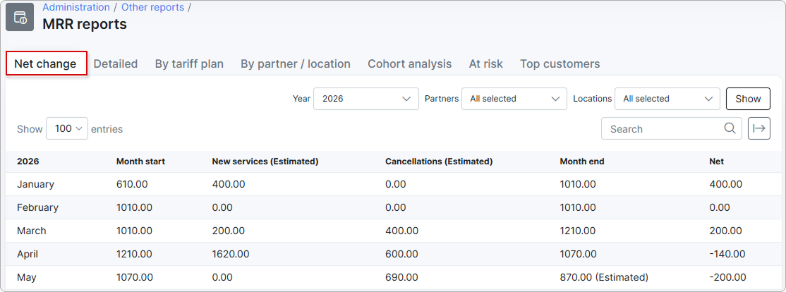
The Net change tab gives you a month-by-month picture of MRR for one calendar year — where each month started, how much new revenue arrived, how much was lost to cancellations, and where the month ended.
¶ Filters

- Year — required; defaults to the current year.
- Partners, Locations — see Common filters.
¶ Table
One row per month with the following columns:
| Column | Description |
|---|---|
| Month start | MRR on the first day of the month. Marked (Estimated) if the exact date is missing and the nearest snapshot was used. |
| New services (Estimated) | MRR added during the month by services that started inside the month, prorated to the days they were active. |
| Cancellations (Estimated) | MRR removed during the month by services that ended inside the month, calculated the same way. |
| Month end | MRR on the last day of the month. Marked (Estimated) with the same fallback rule. |
| Net | Month end minus Month start — the actual change in MRR for the month. |
¶ Why "New − Cancellations" may not equal "Net"
Net compares the two month-boundary snapshots, which include every kind of MRR movement — upgrades, downgrades, quantity changes, discounts starting or ending, and so on. New services and Cancellations only cover services that started or ended inside the month. The gap between them is everything else that moved a customer's MRR up or down.
¶ Detailed tab
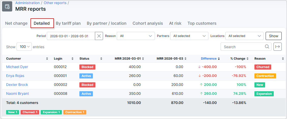
The Detailed tab lists, customer by customer, every MRR movement in a chosen period — and tells you what kind of change drove it.
¶ Filters

- Period — date range; defaults to the current month.
- Reason — restricts the list to one type of change. Options: All, New, Churned, Upgrade, Downgrade, Expansion, Contraction, Discount started, Discount ended, Other.
- Partners, Locations — see Common filters.
¶ Table
One row per customer who changed during the period. The two MRR column headers show the actual start and end dates from the Period filter — for example, MRR 2026-04-01 and MRR 2026-04-30.
| Column | Description |
|---|---|
| Customer | Customer name. |
| Login | Customer login. |
| Status | Customer account status (e.g., Active, Blocked). |
| MRR (start date) | Customer's MRR on the first day of the period. |
| MRR (end date) | Customer's MRR on the last day of the period. |
| Difference | MRR (end date) minus MRR (start date). |
| % Change | Difference divided by the starting MRR, expressed as a percentage. |
| Reason | The categorized cause of the change. |
The footer row shows the total customer count, total MRR at both dates, total difference, total percent change, and a color-coded breakdown by reason.
¶ How the reason is decided
Splynx inspects what actually happened to the customer between the two boundary dates and picks the reason that fits best:
- New — the customer joined inside the period.
- Churned — all of the customer's services ended inside the period; current MRR is zero.
- Upgrade / Downgrade — the customer's service was switched to a higher- or lower-priced tariff plan.
- Expansion / Contraction — quantity increased or decreased without changing the tariff plan.
- Discount started / Discount ended — a discount became active or expired during the period.
- Other — none of the above categories matched cleanly.
¶ By tariff plan tab
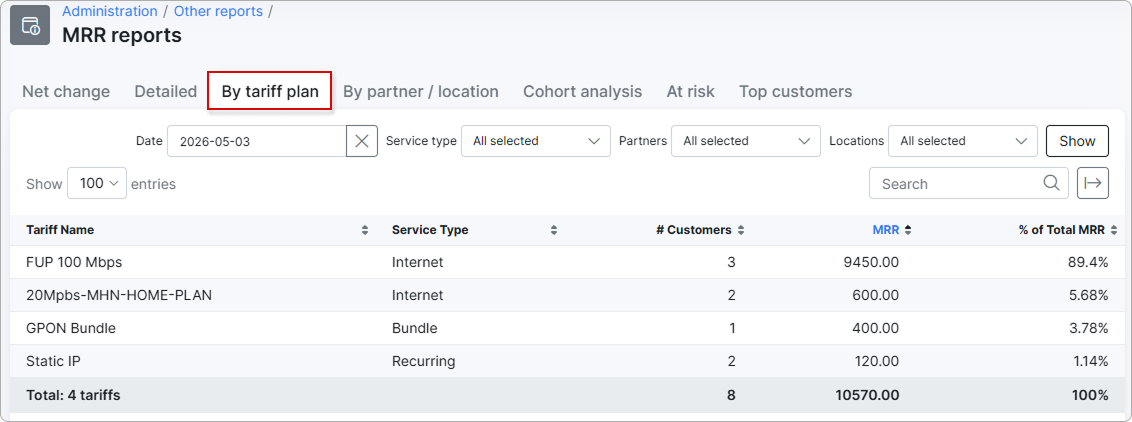
The By tariff plan tab shows which tariff plans are bringing in the MRR on a chosen day, so you can see where revenue is concentrated and how tariff plans compare against each other.
¶ Filters

- Date — single date; defaults to today.
- Service type — multi-select; limits the result to certain service types. Options: Internet, Voice, Recurring, Bundle. Defaults to All selected.
- Partners, Locations — see Common filters.
¶ Table
One row per tariff plan that contributed MRR on the chosen date:
| Column | Description |
|---|---|
| Tariff Name | The tariff plan name. |
| Service Type | Internet, Voice, Recurring, or Bundle. |
| # Customers | Number of customers on that tariff plan who contribute MRR on the chosen date. |
| MRR | Sum of those customers' MRR for that tariff plan. |
| % of Total MRR | The tariff plan's share of total MRR on that date. |
The footer row shows total tariff plans, total customers, total MRR, and 100 % to confirm the percentages add up.
¶ By partner / location tab
The By partner / location tab shows how MRR is distributed across partners or across locations on a given date. You can compare two dates side by side to see growth or decline.
¶ Filters

- Group by — Partner or Location; controls how rows are grouped.
- Date — single date; defaults to today.
- Compare to — optional second date. When set, the chart and table show both dates side by side.
- Partners, Locations — see Common filters.
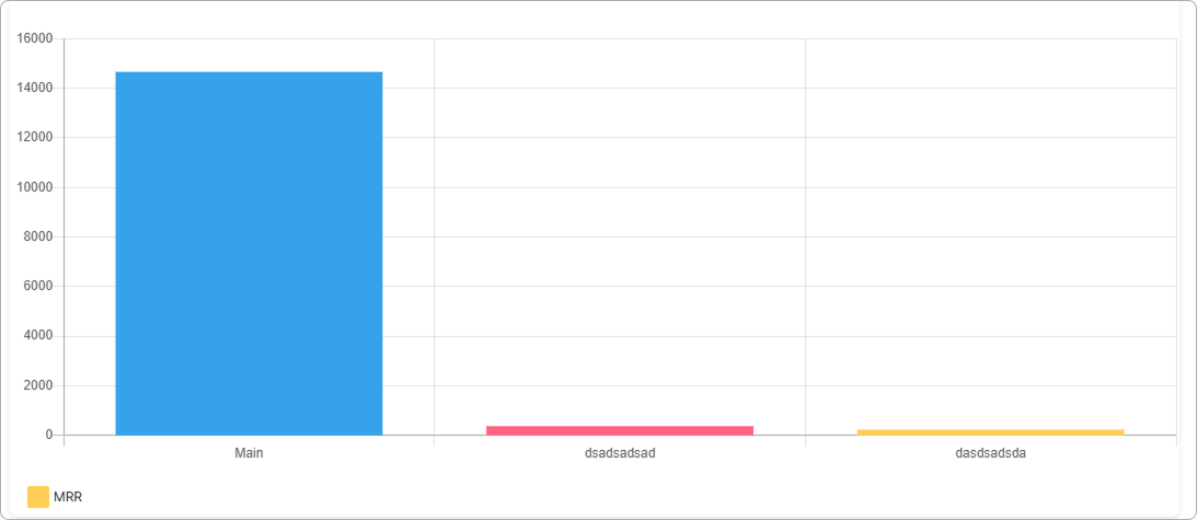
¶ Chart
The chart is a bar chart:
- The X axis lists the partners or locations, depending on Group by.
- The Y axis is total MRR for that group on the selected date.
- When Compare to is set, two bars per group are drawn — one for each date — so you can see the difference at a glance.
- The legend below the chart toggles each dataset on and off.
¶ Table
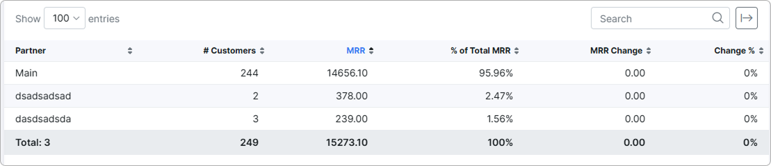
One row per partner or location:
| Column | Description |
|---|---|
| Partner / Location | The group name (column header changes with Group by). |
| # Customers | Customers contributing MRR in that group on the chosen date. |
| MRR | Sum of those customers' MRR. |
| % of Total MRR | The group's share of total MRR. |
| MRR Change | Difference between the two dates when Compare to is set. |
| Change % | The same difference as a percentage. |
The chart and the table use exactly the same numbers.
¶ Cohort analysis tab
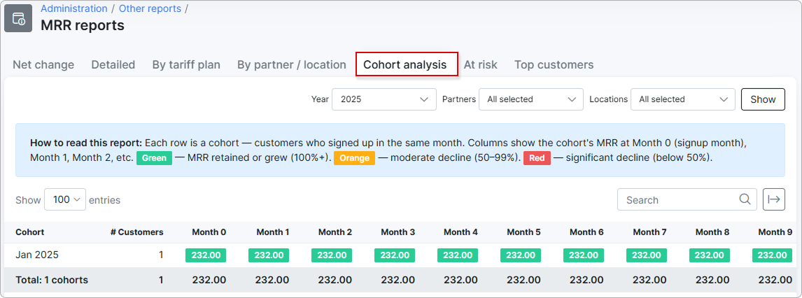
The Cohort analysis tab is the classic SaaS retention grid: it groups customers by the month they signed up and tracks how much MRR each group still contributes as months go by.
¶ Filters

- Year — the year whose cohorts you want to analyze.
- Partners, Locations — see Common filters.
¶ Grid
- Rows are cohorts. Each cohort is the set of customers whose account creation date falls in the same calendar month — for example, Jan 2025 groups every customer added in January 2025.
- Columns are Month 0, Month 1, …, Month 11. Month 0 is the signup month, Month 1 is one month later, and so on.
- Cells are the cohort's MRR at that offset, taken from the latest available snapshot in the corresponding calendar month. Empty cells mean no snapshot was found for that cohort and offset, or the offset is still in the future relative to today.
- The # Customers column shows the size of the cohort.
¶ How to read the grid
- Move along a row left to right to see how a single cohort's MRR evolves over time.
- Move down a column to compare cohorts at the same age — for example, "what is each cohort's MRR three months after signup?".
- A row that holds steady from left to right is a cohort that retains its revenue. A row that drops is a cohort losing customers, downgrading, or both.
¶ How cohorts are formed
Customers are placed into cohorts by their account creation date, not by the date their first paid service started. A customer created in March who only activated a service in May is still part of the March cohort.
¶ At risk tab
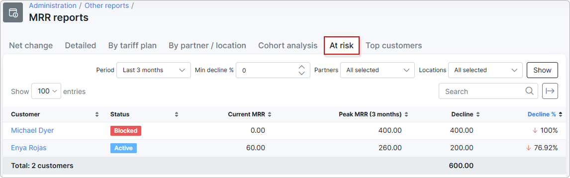
The At risk tab flags customers whose MRR has fallen significantly below their own historical peak inside a chosen look-back window — so you can prioritize retention outreach.
¶ Filters

- Period — Last 3 months, Last 6 months, or Last 12 months; defaults to the last 3 months.
- Min decline % — only customers whose decline is at least this large appear. Defaults to 0, which means every customer whose MRR ever dropped from their peak inside the window will appear; raise this value to focus on more severe declines.
- Partners, Locations — see Common filters.
¶ Table
One row per at-risk customer, sorted by largest decline first:
| Column | Description |
|---|---|
| Customer | Customer name. |
| Status | Customer account status. |
| Current MRR | MRR on the latest available snapshot date. |
| Peak MRR (N months) | The customer's highest MRR within the selected look-back period. The header shows the chosen window — for example, Peak MRR (3 months). |
| Decline | Peak MRR minus Current MRR. |
| Decline % | Decline divided by Peak MRR, as a percentage. |
The footer shows the total number of at-risk customers and the sum of their Current MRR.
¶ How "at risk" is decided
For each customer Splynx finds the highest daily MRR inside the chosen window (the peak) and compares it to the latest daily MRR (the current value). A customer appears in the list when:
- Current MRR is lower than Peak MRR, and
- The decline is at least the value in Min decline %.
A customer who churned completely shows Current MRR = 0 and Decline % = 100 %, and sits at the top of the list — these are usually the most urgent.
¶ Top customers tab
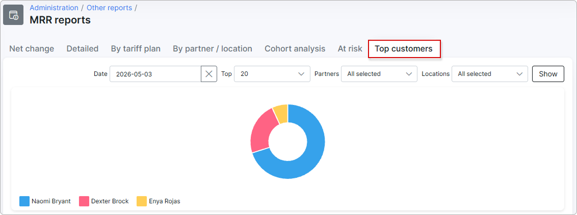
The Top customers tab shows the highest-paying customers on a given date, with a doughnut chart for visual share-of-revenue and a ranked table.
¶ Filters

- Date — single date; defaults to today.
- Top — how many customers to show. Options: 10, 20, 50. Defaults to 20.
- Partners, Locations — see Common filters.
¶ Chart
The chart is a doughnut. Each slice is one customer; slice size is proportional to that customer's MRR. The legend below the chart lets you toggle individual customers on and off.
¶ Table
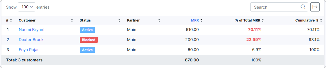
One row per customer in the top N:
| Column | Description |
|---|---|
| # | Rank (1 = highest MRR). |
| Customer | Customer name. |
| Status | Customer account status. |
| Partner | Partner the customer belongs to. |
| MRR | Customer's MRR on the chosen date. |
| % of Total MRR | Customer's share of total MRR. |
| Cumulative % | Running cumulative share — the percentage of MRR represented by this customer and all customers ranked above them. Useful for spotting concentration risk ("the top 5 customers account for 80 % of MRR"). |
The footer shows the total customer count and total MRR for the rows shown.
¶ Performance and timing
- Daily snapshot, taken once a day. Numbers for today are typically available only after the daily cron runs. Same-day service or discount changes show up the next day.
- Background processing. Each tab runs as a background task. Heavy reports — long date ranges, many customers, multi-year cohorts — can take from a few seconds to a couple of minutes to load. The page tells you when a calculation is running.
- MRR is recurring revenue, not invoiced revenue. The figure is built from active services and discounts, not from invoices, transactions, or payments. A customer who pays late still contributes MRR; a one-off charge does not.
- Filters narrow the customer set, not the formula. Selecting partners or locations limits which customers are summed; the calculation rule for each customer's MRR does not change.
- (Estimated) labels mean the exact target date had no snapshot, so the nearest available date was used. This is normal for the future and for dates before MRR collection was first enabled.
¶ Data export
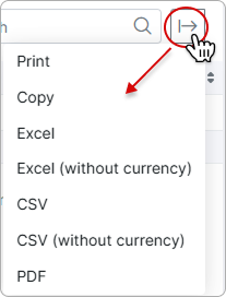
Use the export button  in the top-right corner of any tab to print, copy, or export the table as Excel, CSV, or PDF. The Excel and CSV options are available with or without currency symbols.