¶ Helpdesk worklog reports
- Overview
- Filters and controls
- Logged time per admin
- Logged time per ticket
- Logged time per customer
- Labels statistics
- How logged time is calculated
- Examples
- Permissions
- Related pages
¶ Overview
The Helpdesk worklog reports show how much time your support staff have logged against tickets over a chosen period. Logged time (worklog) is the time an administrator records for work performed on a support ticket: when the worklog feature is enabled, a Time spent (minutes) field appears on the reply and note forms of a ticket, and the running total is shown as Total time spent on the ticket's right-hand panel. This report gathers those entries into summary views. It answers questions such as who spent the most time on support, which tickets consumed the most time, which customers generated the most support effort, and how logged time is distributed across ticket labels.
To open the report, go to Administration → Reports and, under Other reports, select Helpdesk worklog reports:

The report is split into four tabs, each summarizing the same logged time from a different angle:
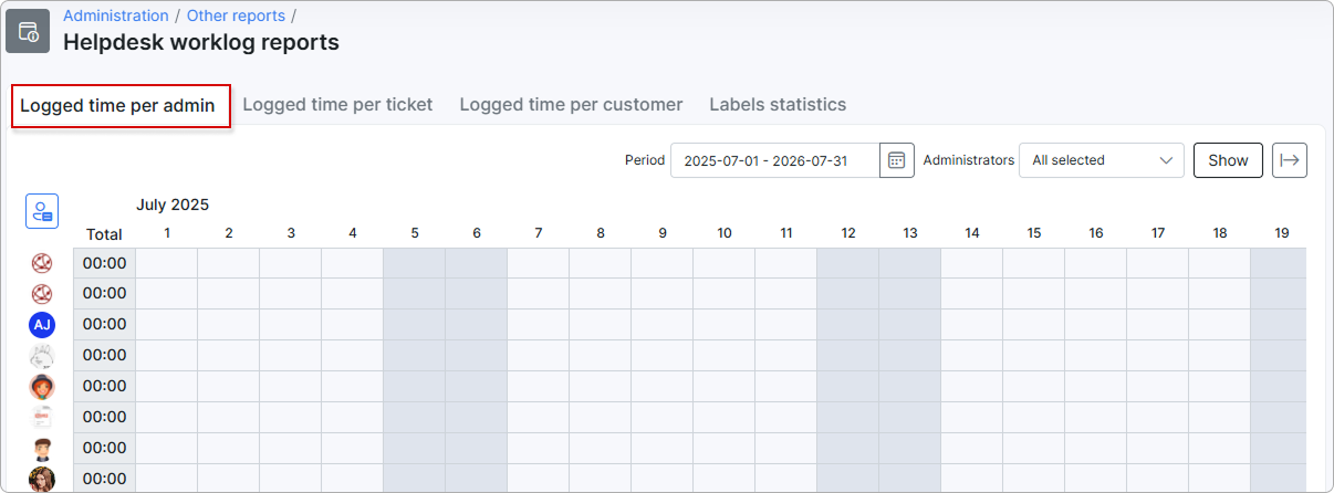
- Logged time per admin — a day-by-day chart and grid of the time each administrator logged.
- Logged time per ticket — total time logged on each ticket.
- Logged time per customer — total time logged across each customer's tickets.
- Labels statistics — total time and ticket count for each ticket label.
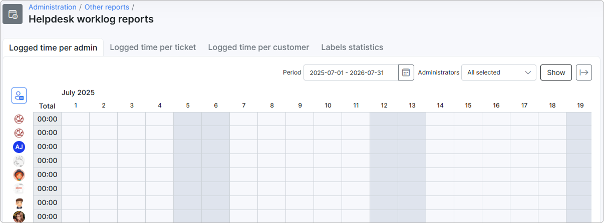
To capture any data, the worklog feature must be enabled first: go to Config → Integrations → Main modules and turn on Work log in the Tickets card. It is disabled by default. By default, the report is available only to the Super Administrator; access for other administrators is granted through role permissions.
¶ Filters and controls
Every tab has a Period filter and an Export button. The remaining controls differ between the per-admin grid and the three list tabs.
- Period — a date-range filter (start and end date) that sets the time window the report covers. It defaults to the current month, but you can set any range. Only time logged within this range is included. Use the clear (
×) button to reset the range, or the refresh button next to it to reload the data. - Export — the
Export to CSVbutton at the top right downloads the current tab as a CSV file, so you can open the data in a spreadsheet.
On the Logged time per admin tab:
- Administrators — a multi-select dropdown (default All selected) that chooses which administrators appear as rows in the grid.
Show— applies the selected Period and Administrators and redraws the grid.
On the Logged time per ticket, Logged time per customer, and Labels statistics tabs:
- Search — filters the rows shown in the current tab by the text you type (for example, part of a ticket subject or a customer name).
- Show N entries — sets how many rows appear per page (default
100). Use the pager at the bottom right to move between pages. - Columns can be sorted by clicking the column header; the tabs open sorted by Total time.
- Actions → View — on the per-ticket and per-customer tabs, each row has a
Viewaction that drills down into the details behind the total. On Logged time per ticket it shows how much time each administrator logged on that ticket; on Logged time per customer it shows the customer's tickets with the time logged on each.

¶ Logged time per admin
This tab presents each administrator's logged time in two ways: a Logged time per day chart at the top, followed by a day-by-day grid.
¶ Logged time per day chart
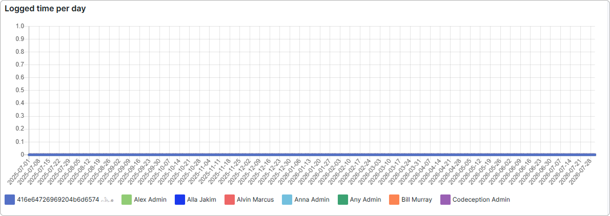
The chart is a line graph that plots how much time was logged each day of the selected period. The horizontal axis is the days in the period; the vertical axis is the amount of time logged (in hours). Each administrator is a separate colored line, listed in the legend below the chart, so you can compare who logged time on which days. Select Show more to reveal additional administrators in the legend.
¶ Grid
Below the chart, the grid shows one row per administrator and one column per day of the selected period. The days are grouped under a month heading (for example, July 2026).
- The Total column (left of the day columns) shows each administrator's total logged time for the whole period.
- Each day cell shows the time that administrator logged on that day.
- All values are shown as
hh:mm(for example,00:00when nothing was logged).
Use the Administrators filter to narrow both the chart and the grid to specific staff, and the Period filter to change the range of days shown.
¶ Logged time per ticket
This tab lists every ticket that has logged time within the selected period. Each row is one ticket, sorted by Total time.
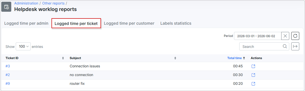
| Column | Description |
|---|---|
| Ticket ID | The unique identifier of the support ticket. |
| Subject | The ticket's subject line. |
| Total time | The sum of all time logged on this ticket within the selected period, shown as hh:mm. |
| Actions | A View action that opens the ticket's logged worklog entries. |
¶ Logged time per customer
This tab groups the same logged time by customer, so you can see how much support effort each customer has generated. Each row is one customer, sorted by Total time.
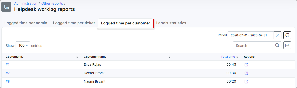
| Column | Description |
|---|---|
| Customer ID | The unique identifier of the customer. |
| Customer name | The customer's name. |
| Total time | The sum of time logged across all of this customer's tickets within the selected period, shown as hh:mm. |
| Actions | A View action that opens the logged worklog entries for that customer. |
¶ Labels statistics
This tab groups logged time by ticket label, so you can see which categories of work consume the most time. Each row is one label, sorted by Total time.
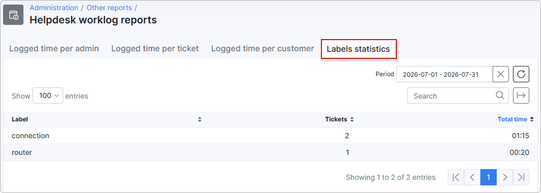
| Column | Description |
|---|---|
| Label | The ticket label. |
| Tickets | The number of tickets carrying this label that have logged time within the selected period. |
| Total time | The sum of time logged on tickets carrying this label within the selected period, shown as hh:mm. |
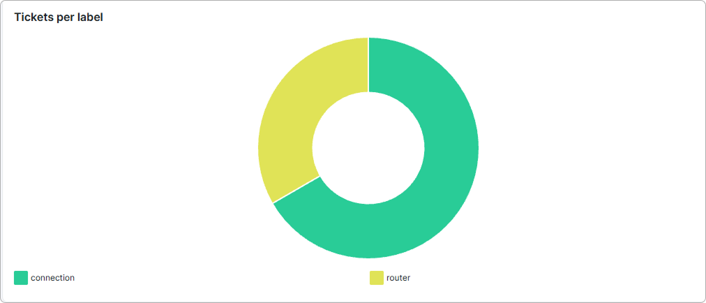
Below the table, a Tickets per label doughnut chart shows how the tickets are distributed across labels, so you can see at a glance which labels account for the most tickets.
¶ How logged time is calculated
All four tabs start from the same source — the individual time entries administrators log on tickets — and simply group and total them differently. Only entries whose date falls inside the selected Period are counted.
¶ Logged time per admin
- The report collects every worklog entry logged within the selected period.
- Entries are grouped by the administrator who logged the time and by the day it was logged.
- Each day cell shows that administrator's total for that day, and the Total column shows their total across the whole period, both as
hh:mm. The chart plots these same daily totals as one line per administrator. - The Administrators filter limits which administrators are shown, but not how each total is calculated.
¶ Logged time per ticket
- The report collects every worklog entry logged within the selected period.
- Entries are grouped by ticket.
- For each ticket, the logged time is added up and shown as
hh:mmin the Total time column.
¶ Logged time per customer
- The report collects every worklog entry logged within the selected period.
- Entries are grouped by the customer the ticket belongs to.
- For each customer, the logged time from all of their tickets is added up and shown as
hh:mm.
¶ Labels statistics
- The report collects every worklog entry logged within the selected period.
- Entries are grouped by the label(s) assigned to their ticket.
- Tickets shows how many distinct tickets with that label had logged time in the period.
- Total time shows the summed logged time for those tickets, as
hh:mm.
¶ Examples
Reviewing staff workload. A support manager opens Logged time per admin for the current month to see how much time each administrator logged, day by day, and reads the Total column to compare totals across the team.
Month-end effort review. On Logged time per customer, the manager sees, per customer, how many hours the team spent on their tickets — useful for spotting customers who consume a disproportionate amount of support time.
Investigating a busy ticket. On Logged time per ticket, the manager sorts by Total time, finds the ticket with the highest logged time, and clicks View to see the individual time entries behind that total.
Understanding where time goes. On Labels statistics, the manager sets the Period to the last quarter to see which labels (for example, Installation or Billing) accounted for the most logged time, then exports the tab to CSV for a report.
¶ Permissions
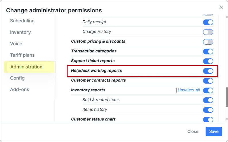
By default only the Super Administrator can open this report. To give another administrator access, enable it in that administrator's role permissions: